BACKGROUND
Entry management is a major usecase for event producers. A good check-in system that is easy to learn and use completes a ticketing solution as entry managment staff are often temperary one time hires.
I designed the first version of the check-in app using mobile standards. A second version was designed after visiting several customers and understanding the usage patters. The app was developed for iOS and Andriod. The second version included an iPad version.
Design Process
User feedback is the core of the design process. I think it's important to seek user feedback no matter how small the design project is. For this project, we wanted to test the workflow in a live environment. We quickly made a version one and released it to our customers. There are things you can not test for with a controlled usability test in a mock situation, sometimes it's best to get feedback in the field.
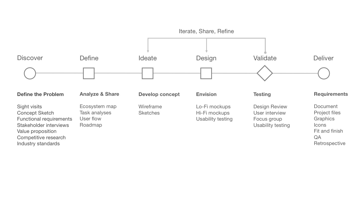
V1 Product Design
One unique design choice that we made that was different than competitor check-in apps is how we handle guests with multiple tickets on the check-in list view. Most apps have a ticket count that could be changed next to the guest name. The user experience of this had many steps. We chose to instead list each ticket as a seporate line, flattening the UI and speeding up the process. This was a case to follow Fitts's law creating a bigger target for the primary action for the app and reduce the steps to complete the task. A few seconds multiplied by 1000 guests is a lot of time saved.
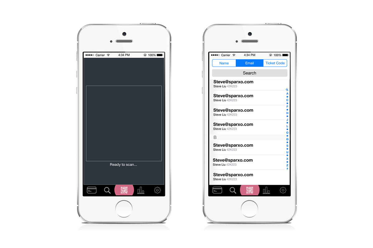
V2 Product Design
The performance of the first application was an issue. We decided to rebuild the application and bring developement inhouse for better code quality. This was a great opportunity to redesign the UI experience of the app. While visiting customers to observe their entry management process. We learned that switching between search view and scan view was a constant pattern. Search was also used a lot but the users would often search in a wrong list. For example, they would search for a name when viewing the email list.
We changed the experience to fit this usage pattern. The search box would search all lists and display the ticket holder details regardless of what was searched for. Navigating to the scanning UI was changed to allow for quick switching between views.
FUTURE DEVELOPEMENT
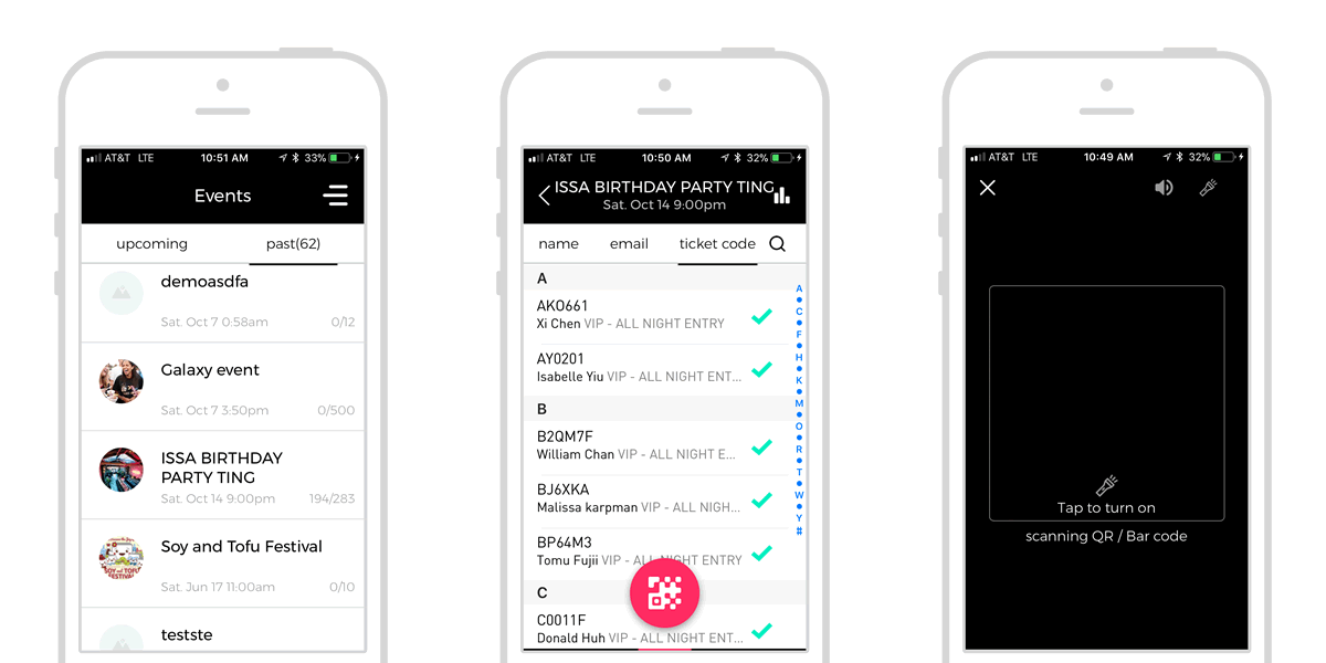
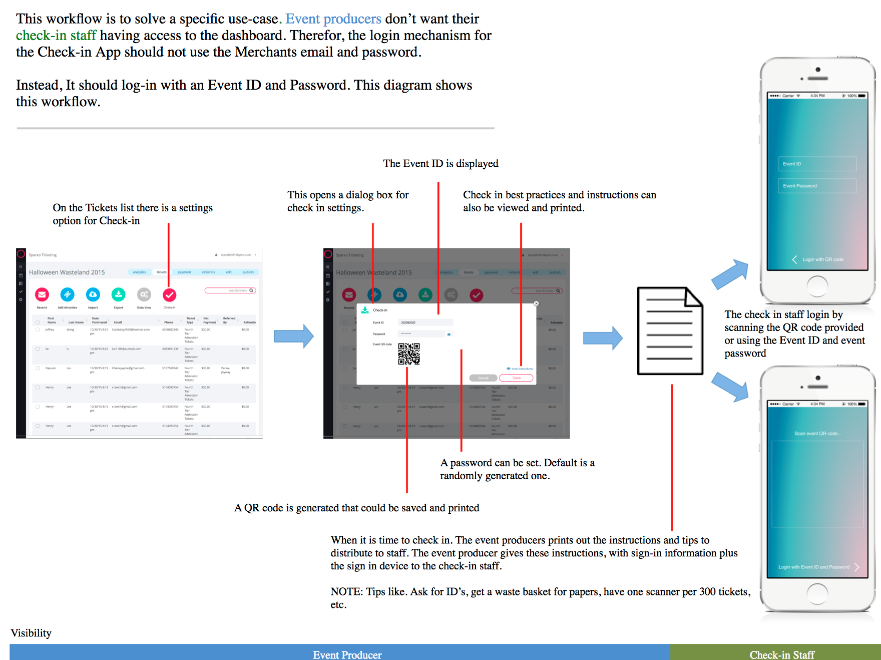
A major ask from event producers is to be able to quickly onboard entry managers to the check-in scanners without giving them account access. Even the market leaders in self service ticketing do not offer this feature. This proposal looks at the user experience between two groups of users and how each interface interacts with a workflow that goes beyond the bounds of each UI.
RESULTS
The redesign of the app reduced support calls to zero. An engineering vision was developed to build in a permission access system.